


If you are planning to update your wardrobe or to refresh your home’s interior and décor in upcoming weeks, you should keep in mind that Spring 2015 will be quite untraditional when it comes to colours and colours combinations. The spring season is typically associated with bold and bright colours that create a pop-out cheerful mix. This year, however, spring will be softer and cooler that the usual. According to Pantone, known as the global authority on colour, Spring 2015 will focus on the so-called “en plein air” theme. It consists mainly of soft, cool and nature-like neutral tones. These daydream colour combinations will be a reflection of people growing need to disconnect from technology and simply relax, unwind and take some time.
Calming Colours
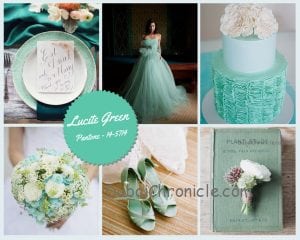 This section includes Aquamarine, Lucite Green, Classic Blue, Dusk Blue and Lavender Herd. All of these colours are very relaxing and soothing. Colours like Aquamarine and Lucite Green are also very energizing, due to their more cheery nature. However, they are not considered to be bold. Nevertheless, the calming colours that will dominate the Spring 2015 season generally mix well with more neutral and subtle tones. For instance, Dusk Blue goes great with Glacier Gray and Treetop, whereas Lavender Herb can be easily balanced with Toasted Almond. When decorating a room with these colours, avoid mixing them together. Don’t afraid to go a bit bold with them. For instance, paint the walls in Dusk Blue or the floors in Lavender Herd. With Classic Blue, you can even take things one step further by giving it a wildcard to your entire home.
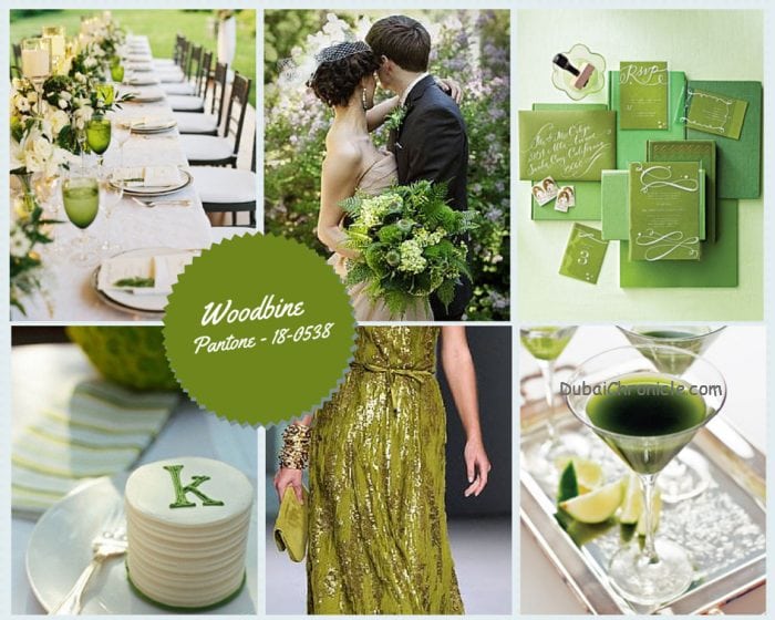 Tropical Colours

This year’s spring will also include a couple of tropical colours. Scuba Blue and Woodbine may seem like two completely opposite tones at first sight. Scuba Blue is more daring and playful, whereas Woodbine is rather neutral. However, they have a lot in common. The most important similarity between them is that they need to be balanced with more subtle colours. In fact, they combine well with calming colours. Mix Scuba Blue with Classic Blue or Lucite Green. Woodbine, on the other hand makes a great pair with Lavender Herd.
Nature-Inspired Colours
 Spring 2015 will also feature a lot of natural colours, which is rather strange for the season. Among them will be Toasted Almond, Glacier Gray, Treetop and Sandstone. Their main characteristic is that they make the perfect background colours. In other words, they combine well with many other tones and they do not take the central stage. Instead, they just highlight the other colours in the mix. If you want to create a comforting, welcoming and warm atmosphere in a room, these colours are your solution. Another advantage of these nature-inspired colours is that they are practically timeless and very versatile.
Cheerful Colours
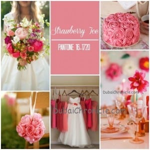 Of course, spring will not be spring if you do not add some clothes, accessories and home decorations in cheerful colours to your life. This year, that place will be taken by Strawberry Ice, Tangerine and Custard. All three of these colours do not look bad even if you overuse them. Nevertheless, not everyone can appreciate an overdose of Strawberry Ice, for instance. If you are one of these individuals, simply limit them to accessories or small elements in your home.
 Last, but not least, the colour of 2015, Marsala, will also make an appearance this spring. Moreover, it will serve as the foundation for the entire colour theme of the season. It is one of the few colours of Spring 2015 that can make a room or a look pop out. However, do try to combine it will the tones in the “en plein air” theme. It mixes best with more subtle colours like Classic Blue and Sandstone.


