


Color authority Pantone has for the first time anointed two colors of the year for 2016. Dubbed Rose Quartz and Serenity, they are shades of pale pink and baby blue.
The company’s announcement is an annual event that is closely watched by the design and fashion industry as the tipoff to a trend that usually spreads through home décor, fashion and design for several years. It tends to unleash a cascade of announcements from retailers revealing their own products in the colors.
This particular pastel pairing calls to mind a balloon bouquet announcing a pair of babies, but Pantone says that isn’t the aim. These shades, they say, were chosen to convey rosy warmth and tranquility. As for baby stuff, they don’t want to go there.
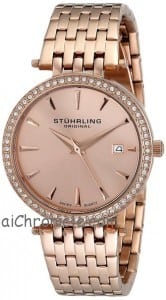
Still, Rose Quartz could face some challenges if it were forced to go it alone. That’s a bit too sugary for men, but it offers freshness. Nude pink apparel has been a best-seller for womenswear in 2015.

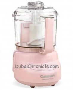
Pantone, owned by Washington, D.C.-based Danaher Corp., has a system that helps manufacturers define color precisely. Every year, the company polls décor and fashion designers, as well as manufacturers and retailers, on what colors they plan to use to pick the color of the coming year. Pantone tips off some marketing partners so that they can create products, such as Sephora cosmetics and KitchenAid home appliances makers, that use the colors. It even churns out its own popular mugs in the shades. This year’s mug will have both colors—one on each side, like yin and yang.
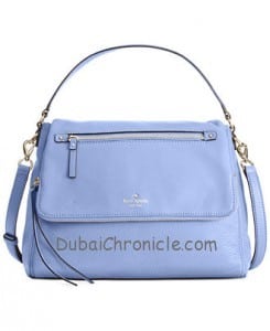
 This year’s two colors are so often seen together that they are a natural pairing. From a business perspective, it’s two colors, so it’s an opportunity to make extra combinations. It makes for a perfect combination in the home for tablecloths, glassware and ceramics.
Previous Pantone Colors of the Year have tended to be bold, such as the purple-pink Radiant Orchid chosen for 2014, or the bright orange Tangerine Tango chosen for 2012. Only two of the 16 colors chosen since 2000 could qualify as pastels—2003’s Aqua Sky and 2000’s Cerulean. Pantone’s choices have commerce in mind—the company susses out colors that will resonate with consumers—so the choice suggests a sharp turnabout in consumer sentiment.
 Pantone’s news release describes the colors as “inducing feelings of stability, constancy, comfort and relaxation,” and argues that they “create balance in a chaotic world.”
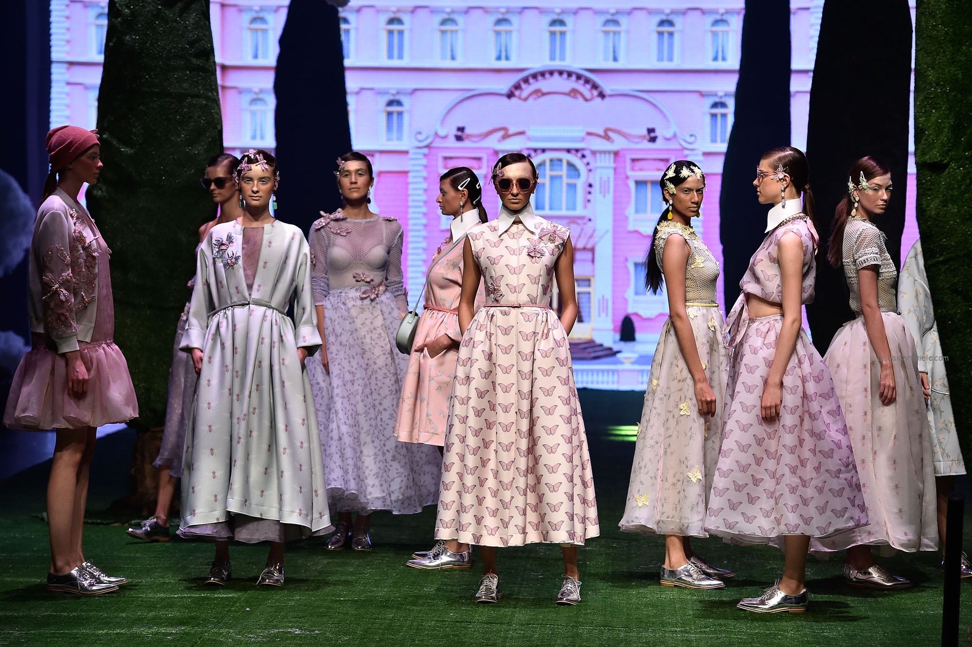
The choice also reflects a surprising pastel trend that has been on fashion runways in recent seasons. Pastels can seem to convey weakness and they don’t pop visually the way bolder colors do, yet pastel pinks and blues appeared in many collections for spring. Thom Browne mixed saccharine shades of blue and pink in his collection for spring.
 Forecasting colors is a tricky business. It can take several years for a new color to take hold broadly. A color may feel new, and then seem to be ubiquitous a year or two later, ultimately falling out of favor. Anyone alive in the 1970s is likely to remember the avocado shade that swept the kitchen-appliance business.
Some colors—such as many shades of blue—are perennially popular in home goods and apparel. Blues are flattering to any skin color, and bright shades like cobalt or turquoise are vivid against neutrals. Other colors can serve as enticing irritants: Bold orange looks appeared in dozens of spring collections as attention-getting contrasts.


